By Barbara Green
In the past, retailers thought of their mobile storefront as a kind of showcase, rather than as a real supplement to the ecommerce bottom line.
But the number of mobile sites that see the mobile interface as a true revenue stream grows every quarter, and the ability to succeed in the mobile world is becoming a business imperative, not just an option.
It helps to view the mobile storefront as you do any retail outlet. If you optimize for the market, sales revenue will always go up.
The following techniques can help you design your mobile site for optimal conversion success.
1. Make a good first impression
The mobile landing page could be a design course in itself.
The limited real estate of the mobile display demands good design principles in a way that Web sites never did.
The following guidelines help your customers make a quick choice from the landing page, enhancing their experience and the chance of a purchase.
Include a banner. The banner can link to a featured product, a list of popular items (buyer’s choice), a sale category or an online discount or promotion that can be entered from the mobile device.
Make sure that the banner image is sized correctly and that it reads well on the small display area. If the image is busy – lots of text or people – you might want to include separate images for portrait and landscape orientation.
Simplify the top level. Include a maximum of five to nine category choices at the top level.
Font size should be readable and category names must be clear. If the customer does not know what the category name means, she will not click on it.
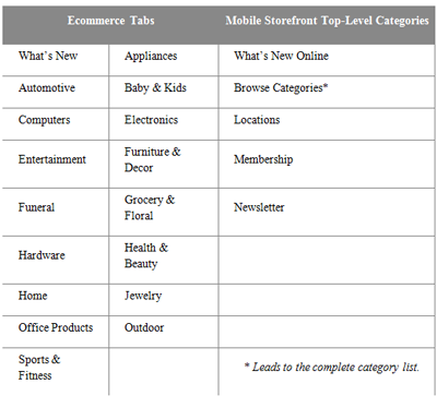
Mirroring the tabs on the ecommerce site is generally not the way to go, unless your ecommerce store has a strong, simple design with few choices at the top level.
Consider the following example from a major warehouse store:

Because the Browse Categories choice leads to the complete category list, the retailer did not need to change its catalog structure. But the simplified top level gives the customer an easy choice.
2. Offer a visible, usable search feature
More than half of customers who shop on a mobile device use the search feature.
The mobile interface should offer a prominent search feature that allows the customer to quickly find an item if she comes to the storefront with a choice in mind.
The corollary to this feature is that the products in the catalog should include good keywords and clearly searchable product names.
Test searches frequently and thoroughly to make sure they return good results.
3. Keep in sync
It can be a real source of frustration to a customer if the products offered on the mobile catalog turn out to be out of stock.
The nature of a mobile checkout means the customer may not get the out-of-stock notice until she tries to check out.
Updating the mobile data feed frequently can help to prevent this problem. Nightly updates may not be enough. If your stock turns over frequently, you may want to update several times a day.
And do not underestimate the kinds of things a mobile customer will purchase.
If you do a lot of big-ticket items from your Web site, there is no reason to limit the mobile site to accessories. Offering your full catalog on the mobile site can pay off in a big way.
4. Refresh the experience
In some cases, a static interface may be fine, but for a lot of retailers, seasonal changes are the norm.
If your business relies on seasonal promotions, make sure the mobile site also reflects that model. Keeping the mobile content fresh also gives your customers a reason to come back and see what is new.
5. Get the word out
How much effort does your organization put in on advertising your Web site or social media pages? How does that compare to the effort you put in to marketing your mobile site or application?
Make the most of opportunities to advertise and market the mobile site. For example:
Advertise the mobile site on your ecommerce site. Add a link to the mobile application or site from your ecommerce homepage. And make sure your redirect scripts are functioning properly so that mobile users go to the right site every time.
Monitor your ratings. If you have a downloadable application, monitor customer feedback. You may find some good ideas for improving the application, and you want to make sure it is serving your goals.
Make mobile part of the package. When you buy advertising or start a new campaign, include the mobile site. You will improve the site branding and performance just by keeping it in front of your customers on a consistent basis.
Mobile storefronts are a fast-growing part of the retail landscape.
The best mobile stores are a combination of good design, diligent maintenance, and effective marketing.
If you follow a few best practices, you can turn the mobile showroom into an increasingly productive revenue stream.
Barbara Green is technical writer at Digby, Austin, TX. Reach her at [email protected].


