By Naren Madan
Nothing can be more cloying to smartphone users than push notifications. Frankly, it is quite grating to hear your phone buzz and you pick it up only to find that it is just another application telling you something dull and dreary.
In fact, you quickly get to a point where your subconscious becomes numb to it and swiping a bunch of notifications without looking at them becomes common practice.
If in doubt, do not do it
This does not change the fact that data access and push notifications done right can add real value to user experience. Permissions are sometimes even fundamental to the entire app operation, a fact that can be lost on the user in the face of repeated spammy notifications.
But with pushes still being a relatively novel feature, most brands opt to go with the flow and send them out a dime a dozen anyway, with little regard to the fact that it is clearly intrusive to the user’s native space.
Of course, you are going to get better engagement results as compared to not actually sending out any notifications or attempting to interact with the user in real time.
However, that is a lazy way to perceive statistics, especially since there is no frame of reference here. Better content curation could help, of course, but that is again the minimum prerequisite.
But consider this. If the general consensus is that majority of push notifications do not communicate quality information, despite sophisticated personalization, how do you explain the fact that they still maintain an impressive open rate of 40 percent, according to Andrew Chen, a thought leader on all things mobile? How can this be, if all people do is complain about how annoying they are?
Empower the user
The biggest reason could be that users are either unaware of, or not inclined, to take the elaborate method of turning off individual app permissions from settings.
This is especially true of Android phones, which provide default permissions to apps, although this might change soon. Android users are condemned to put up with push notifications until it gets to the point when they start to think that it would not be a bad idea to do a little research to find out how to turn them off.
This argument is backed up by the fact that the iOS push notification service sees comparatively fewer users opting in, given that it forces apps to receive permissions at the time of install.
If this little example is anything to go by, would it not be worthwhile to hand a bit more power to the users to think and choose for themselves the terms under which they would like to receive their pushes?
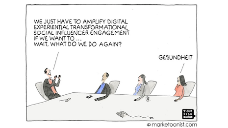
 Bored meeting
Few apps take the intelligent route and undertake exhaustive research to perfect the timing, going to great lengths to provide users with a bit of context and find out the pain points for themselves before prompting them to make life easier for themselves.
Here are some ways native apps sending out push notifications can make life easy for their users:
● Shorter task completion
One of the biggest disadvantages with even highly personalized pushes is that after doing the tough part in getting the user's attention, it then undoes the good work by taking them through a completely irrelevant landing page and a series of labored steps before arriving at the final action. No wonder consumers are annoyed.
It is worth going that extra mile to enable quicker task completion that is accessible to the users right from the push, with fewer steps to go through to complete the action.
All it requires is clear content that just needs a quick glance to take in, without too many choices that can overwhelm or distract the user from the focal point, and a clearly defined call-to-action.
● Interactive pushes
Carrying on from the previous point, interactive pushes are a great way to offer customers options with the push.
This is currently unfamiliar territory for most apps, but nevertheless a great way to exploit pushes for what they are: a medium to combine movement of information with clear options to respond.
An ecommerce app that sends out a push about a personalized product recommendation, for example, could have embedded options along the lines of “Buy,” “Track” and “Remind me later.”
A push that comes with two or more options that lets the user perform generic or app-related activities is both quicker and more likely to get a response.
● Allow users to prioritize
The “Remind me later” option in the previous point seems like a great way to detail the users who would be interested in the information you sent out, albeit at a later point.
But that does not mean it has to necessarily involve you sending out the Push again.
The general consensus among marketers is that push notifications could soon go down the email route in terms of intricacy, and that the day is not far off when users can compile their notifications into folders of sorts, sorting them by priority and coming back to them on their own time.
This would completely eliminate any sort of purposeless pushes, and give users complete exclusivity, power to establish the ground rules and control the what’s, who’s and when’s of their personal push notifications.
ULTIMATELY, THE DYNAMICS of each app cannot be categorized under one label. But a little bit of exploration is all it takes to figure out the perfect time, way and content to engage your users through your push notifications.
With the balance of power gradually shifting to the user, selectively filtered and value-adding push notifications will soon be the norm.
 Naren Madan is a mobile marketing specialist at Vizury
Naren Madan is a mobile marketing specialist at Vizury, Bangalore, India. Reach him at [email protected].
{"ct":"+NLylYdaOMY3CGHewqigp70JBupaFaizZWjY6BYDddYvtzRHFY3xNXInRJH9Zp6\/\/ZrQb5zjFykMJQdxN3AUDRcPWNfMejpaDXVlCXqdUG7P1GV0dUqkL7b9HiFDEI7Eqo65RBfYl+bEBYzLNTQTmVrtQ9dfBV2vhAI2veqZtlJj71N24vcr2bsvNPuoGRse\/ekq+ao6jDwKUbvkTX0jP1Kbby8k\/WnbrLwazVDnskvbWIoMClqIqid5N1uKRo+JfEOTze16rv5hd6Q77n0Tn+Qv8t2vCxr6r0U2SXP1iKi+24F7GppDMWct+Eh5ImOLXHGUqbGoHBNtvOXvQanIACq+Pb\/5vWOEdFE8Q6+xETZ7Z98KKOTknVpaqs+p7pzjfNJztPXb7tcD4\/HMgzo\/ECfIzZ7tUGPt9RCQ9ibpY+Cb9JtYs+1i+JnXkGCOGHpflqctUfUKxxg5fxx0SHIavKEn6CbucrAlKcf0Aa\/NeQ5SVBnSEUdbz3ZIRAZfN6KG5RnmQL19u84hASvQwi00sC4aAv\/FDxIxkToUmi2brp4e6KQUohJQO9Wp+RtBQ4fsnv1lOtU+d32pg24Sf0aXRqntV3Fv+yXsmCQpmwJnTWIHzXUwu3cttX2yipiV4OpGKNCOcrn3sW4nmdddUjXFgxXu8cz3GmewmD0fqly2WpNczoq4ecdc3Phffn\/SSDht8Pd4DBmmNC5sHf5RQsSIe4twtE8EshltCP2iECmYF5HeBV+WWmKLU8QNga2ikfIKJzCb4qXOkOYgfvIK3Xku362fjueAxTRzwRFQhsVAXCNY\/VILdjzVxJXY\/ZbmkKDJC+7Hc6iKieANsLIQmP0fPeHNHdClkxKBZmtdyGlkjLp0ewG82fTEbQgPPLznL9eBUpidWM\/l22\/CG+ILU3fRBjA4oXjJ3lJpxEP7BrlkArv63Nrz\/tkhN6g9+rhXHCpxFSbpiAcoca9yWlAILDGRocyeunFnx94e8GlVa7O9KscJNk4JZEgnMKmCbABxBdx4twtgpFvo\/Uxpyx9DkUtMbtkhQqOxCV19M9mCdOZkrzVwIN0vccNkTvwKL7AXLasJ\/\/1IJDqE57c6CLbUBGxU4Z4XF5ju0zBkOqoxKRoiqv\/ehvaUL3tGcbNlJHeNrhbL72n81eA2Z2wpX8s8efvhhIDaLKrWiWDg0hEGF8uElzSRJ\/YhaFfhbzXV2GKXXhJZXySXNwz0qh35LkG4OftjPIYdE3ZIKfame3xp\/v3o\/5PsznLcfFugR7Q08+ZIcNpPBLZzHDMv9\/eTTo2PKXhCgSm4VB4w02Dcj6BXaAHuDup\/CrB4vwXVeIL6q\/AKtEfzgQ5YmiVrW341glLPkku3batYnhAiDgUyhsAiaBQUaWvBJCmalgPrDN5XJ9ydhU7DQEOmvRzzYuV4XCMGWqIYWIz3hCTsjngYynNgZHOaHAo5kABHVTlLi4\/3xxfV8sOadjFlYWP3znw7jUGOdxCQ+siZ5dooJW3+\/9Z+6LvrlWQV50CuNRS+rQUCzBwRbztRW8sscqQonUy9mMXuRg1RjivgTyPWxxx00MqUjJhal5mnDvHB7UKBefBcK3qN6vGqB1DzTLpeIH\/ZH2ZpyjASousG2vnPZdzQcRI8CQHhcPDrb2AKzfVUNoDlUfSEO5xfx97FoW1Xuetj4b749zxjxpOTawmplkp1OooE9th9LKC1kdlM5fFK9DQCpPbK63pPpCf4L+1hysI4YrhptkDk7ES1xbrAMmGO7RfuX\/E\/2WzsAQY6mgYXlGkHx9iYnIfJochb01iql08c34kdpN7GP+w\/K7+3CjkNVDCnf2WEWyE5bBF3svcxaP31y0PMYtyAYdtQ4yVbAUp2b6\/5du9BB4mityl67cGeRns369jAXXI8\/AbTfyHFHkDj9S32Y\/wDnhi8dYKEuUHU0PE173C29KLpj86DGsU46ziwC10I7WudpUucrCAkMer2Dwy93PF5x3pYU4Tz5Ebcb7u4ROQuobg5AdRATVaUDcTWl7sreXHpgKtCZWIDhtcQMkRbPDnDbPNQAS0pDxxGPtyA4ivkr8M0vfS3Wzkmflxv3kBi0\/nSGCx9VKyC6eaABl9vBryLZLY7E5bBatZbYsHQgrmy3oSYGpuotEJcLfKFlhJgF+A8WTXUoKwHWGvkqIf2scIfTeXceWcgzODODoq2a2fTpAU5njKXJqdAPl7M1ei3vdOzvB3LqAP0W1wKBrgEmf+xEX32kpB4u4WW4qzEufiepHrGw3Wh5451WUj3v4jDx9ziQNxsGXHbyBR\/VVMla7aTnY1t3cjPs\/D4hDU7cKhgRnk0jRgKmqDp1v1R+OD52IZJb3iNrU\/xcJN1SAL3qFkOm9qA7mL5xZj7g4exD7vxh2a55HvUtodZFgGCZd29rY0SlPF1AYNwjW4eaS0vu\/xipOgZQMrVmP4PK\/Qk8Pyu21iwdicn4mMiXkWOxhtOUoDupUmTxHm0zGFBTYt4D+XY4GfHaSNYnYnF9djWVEdlGDBgZsE6i4echRYD5hckmMwheGn4j7JGaoQjYuNWYD4mzYTomQm8+nfAvSwdhyPj48yTNDmNJr08JmZm2SN9reLdEMk9psfBUVccpegaVoUiFQw4EeaxnOHN6VNfmxXW4sqi\/kd10m4kC4U+Vy6De7Ix1gDpcihvB+uQr\/t6YNaxWldkPxyakQLYE98CfA7Wj3BXTbXWker9V55mcSvD+o5Hgc\/XUCO8N5b+u7ixZDlURLuTcim4eAG2MdCbg+9zVQuCkKcCVj4aG9FB9ekF9FHIzLxae6b0nKsEV9ELjaM5ZF9vm\/hxn+uN3d5Z4RQO54OjFS7pF1PNS8qsQSaQ6k8d7SLXUtbr0NXvL+9zgPbNFFxz9APr9MNx9IKWmPwdyPJHbZCPUnyLnnKUO5ViBOMNTuBatBGYFyo4xeu0sAvwcCVQpWDwUfUPoKW3EM\/kCkro7JsM6gTqgmxMhwihZshu3QiVnkGeqxsSx84gEF9CRCYv+7lU9Pb5puPvp4mTuV+1FQMN3RpDtkJ\/OdhZroiAXlPSfGAl1tuP7ACGA26hFnObVh95KCobEkg5TDK8wPelh2zhnkzlX47gLpe0CJUuKAu2EuDLPKvovXCB8nEO8c6cXGLUX3\/eIkssax9iOVTn5vPBynYMXlX3WFogQH7X58TqS+eqweXaoOU5Xj7xxyEcpbXMVUpSXLXFh+91XSY9z4BXwKFd8MLniavK9xv+22GnBA7tFF6c+XcRPpPnelyZNhuX195fVQwTWQH24uGe7Z2YN9qVyOYyfWKvL7nYxI2vk4VhcNTLYnY8D1St3eod2F+t2s\/dzPw9SGOFdaLyjodaeTBBFSg5QREP3NSmp+Tkt1UJ1AunqSt3nE1mi\/qEtz00e6jnlH82YQ+5RCpYSjhCCxbrQ1ghAY1INNdsHqDYJ\/C6+wDAHpXvX6Lz5lQp4DbcYuGm3cxqb96qftDru0ZIycJ15W9tRyM6KJXDikhwsw1dK2fC0GwDVE1y1r9WCSlifaI6LNAFAkv1rJ3jysbVFxC+OkE2qOxv4oUTIJUmw6lTeT7FFfnispwPrxwq4K+3pYW8e3RaDGa+xIql+V766T8wUqXT6AsaCI1kW6MndjHfS3Jemorc6GCjmtkEJIMFMnyU4sIQrW0uG2DQURC8PbK7fI4erqUoBHbZx3F4oSmhwlxvnJNcgerIVqM33721RhWsBZZhhIi835jacMwbw3ATl+kTVZPFYLWAfR0kjPk2iiGVS4zGnThD4l3BT88ohjyqKOeLZIbx1RvWQggHbqZ8GjtKWn7SCuAAdd05847cSPK39\/Om6TUNy0ixSZrTjEGvgYncGe\/nKPW4UqA+nJWxCeUrSZkcAJ8guVIj3wcUlLU7h9TkMMp2ZSx8oiko5HC54xJ+zlVz900VEqmcXeqjPiRx5ZITCa2UEiXZfF+2N90IvJjKPt2VtxrHW31SK+79nqw1C1zUc6QxHBGx4uWv2vT53ikb6U9dt1eSM7J6qvbVwydO0mRdpJGv\/SOfsx8r4rqVgffqFuZzr+DOFcsKnxMS+1oB1s2P8hDvY4D\/4zLCQQZImm19iLGB9kg7ZMDoM6vh5Uclw71p6JI\/LhPP3nwRxfKSZd6eTnDcHet+GTPb8\/wKCE8SKXzK+ESHHRhj9qr1j4i2EA1eJ1UF6ZfJQp4bcNBScIi3RySMWSjXfhBB4O4IIQSBXVkskJXyqe8OOgyP6AmyyNcp10oGGXuz7P7+NII4Vf38vO77HQ3XmKCVvWS484EXrNG5oYhuhaP04\/WYCI5t9lXXpXl16xxah2TKjxZn6KCckK1UlQK1x4tpK3zuAhwpsDbokO9T7TV\/Nh2Fb4TSfqgZZqp3\/OEZP9SbK3qz+wHj\/5aDCnT5Z+c84rURrU7fySBs5akAmgdwvCU4EeF4HBIIk\/YC87Gz1vMSFDy+0ONqAWsOoZQjfrUmrfbE2uLYQQ\/fyZo64\/ZD7T+06RfEqx+i\/TarwbOnU263P0ZNwdzO8cB23sACJdSyPoWIX6vLFfQBTj5xO1pPA01jbx\/8U15WphR6efcdGOD4Z9O9t0OYtpuR8uaBAo5fj+RwtRtnnxgeoJqOSl+Dd7gNWo7F+NIwN7PoZzfnJ21eNNAgafVLeJALnlOFjuCKa3gnJiJnsuse97a58wVXjYaXXs8\/BPddozl4hz6gPCsPg949THQpfjwwAOOYXKBA0RWhSNaiPD+1bekWd8GsDNGbLJZkTXuTiUH7cb5qtJ8dKUdcTiPJ0iej1I5nzc9TTaCSCEyTlclRbQmWGMimbErFqD37Eh8x+N1qKu3tXPkAqYSbxEEtSa2lBpuectKz8QUuxZpTvtAGMnhx1iLVU75o\/\/qgiFhfQ63wZU9yHg36WUm0QWIVij4bGQvNIX\/1Iks8qPxgZxzpDaj824+CWysJnyB8TK5X+9ejQgf1CWEll0YF1niSw8SGR4koWsOGdggkrH4V4q+ZvHPCm6GeWnWO+0RO2URnls2\/4I36Knkrl0xX6sPl25ZDVoSEyNXMByMgMAVHDMcL1tsKnskYKu8bIIsDk0CwLc3dmJGggozPrYubPmCk1LNzd5qkkVaxT9jc+ZyIx7px1UpY6ctsH1nTv+SF6fPwWx7x5ONTCaGFzUz2VonomP3Jbgpvg1WYAWyiBYA\/IukThIx8LgXhtiNItGLuTzc0ObEnigb08l9aN8CGnslRqZapVOKNBplNje0b+d0a2Qb+QbASTfzE1EKShg8LNsXa6gUzFNa9GCDLh0xDN1xnDx3MlGmseREdMLv9lpqfnsvhEWijwgfr6zZI6AIkLUoJ+GoM80P884Rsm24JUPefQ5VT1wynv90lcGjMTdqo4Xx+RzBow6fzQzwxiSbiWUTkXFFawxkf4O8iAUOlKQbCSsN3EtfF\/uwmok6coY+F+cXAnIokzqflVzWewBmUpmfvpKnOGKQlBgIFECkz9Nx7jTHmaYzxtFeABD82Peq4Vvj67Sl6fJ2X8zLWl7CtaPXUk35lENMguhYjWNCODTcyp6FELR+0Mhl3ANO9dYblH0CeuXOD53QrNSl1hUuFBaQULldnp3aPGTFmj2+YF+WZoytK7zKymalp6Q0vFdel60QEQe0hDu1qSL98tymc1jXce85YL62K1r8q+mx+3jt2zNKWKKmcBrbhil4CJOTyCvXJ0S4+1LTtQxvoC+BKsz5LW\/LIknUQ\/hAFDCIxeFhM2qiY3n0ElqAUn4dp\/LhKhBCTddfBI4tOcMYkh5tv1\/+jCfVO59kpAOnyPg3xX2nqgftYL\/T1w4uAbbTLO+KTKvYF19cqeDZqfA17dlS0UpbQ2l3UEtQY2MIDV8Xeoq3LlWyno\/2yBbiAY2Ikxz2DN59VuU08GuWDFbMriOVNsKsVzjhd\/zXirOpEge\/UOMrMCjv889K5pXXJQnnGpESg3ITyiAACPAfmEz7DznmrfmzhvmBAIlxO3\/Jqa+sud\/MIitf\/lIxu03xfK2kPFNZ+m47eoT9BX63upBPnr9S649JRv+RlqFx5EvPH80Z4mZFbz2BBq8HX2U\/RiXn0DPiWw\/SinOjwdMuv20jbNbdRCeQrOVwCgAyRefmsrLGkFhIIouZMD7SRcBTyQbg5Aj3ZM5HrlV4nDarKM9PF7O0D9qTc45\/HM3PxV04Z67b13pkOpuCs\/kpCMhGMk4hvaLjtpj9KvK+X5cxs3v\/Gh2VsKMUNSgqNQ3UrqgiBMH1QPvaD6NK3QPS2AKdfQOyf5hvuvlTN3CFQ8nD1z90lOhC89HeFNbqpv2Q7HPb77l7Ny3j2datlh7WeXognLH2LdotKjqT8L+8lCEAejGbOCUieNK2d0Rp0ft3t\/iPGlZrADr6g684p18EvbqS5WDrWNfUpPwMKdkqCgpEl8t5BneUZ\/gu6yjlB5KPj3PLLQcEPm7S2yr+hVfjqGnqaeBl5owL3KCxum+bVtFEmNR6+b2WnX0Ekd9EDULCMdPCqsK1E9S9Tx6LTIumhW7js6drcuNfEWk90SPm\/kZFaGk6eN6V9\/dA54N6VS+5Kky3e74ZaKmbO9g9Q4IDTuhlIHMaeNMMTYYfMEIlY\/LqrfggF+ON\/odEuNgso09N8iKYZrMS+3liJX67zaQNlcSFjJ0N3BHOWwukftR46JAOwhEFRUnmnwAqWRo8K\/pn49yr884xIS+3Mg3ZOLispboSQBEYnz9efdGa75hbjaYoBjMQGd9BfgRUiZWbN7gZOueY\/UwTNGhRl+QBOgL9YGkUKgJoLF9Z4ARQxpI3My24T0HX99drWorUE4YJSASWPbzSPXrOGxuio5xHU6UIgoUH6lOxlE9byms0\/ln8SVMKglP2sp1xMKCQhSAikITB6vxV9qu3ZN7thfnN+vet\/rAmvQXH+att0vS5OoPzr64vmmJIZ44\/UH5Un2F4Actz9OcJpr8XDWwuNnBcN4RphVSqC1BsFmqkD5Wot+0bG5dGIAnOC4P1ZAqPhqOLQ6xZiMq08q6YEWRkrbfGT7IVp\/otQR+TBjiMS29SFPJlAD4BtzJRbIziE7o9nGMDhHFY4a74A0Mei0wvtLkhyFJ7s9f\/FqEU6+4TPhI0R\/XFnrVQe7uKsOQeGUoXF\/euLaRh3AZNxQS+FiMbcNLoLWfvykjlS0MUXCE4gEar3CUoMTGxi88aGMvqFqweAj4TZZ5W\/f97YfXM5tNAJvgww9ItcUFJ+7zcSeu6WUoyHSnNRo3D1y\/vweDrl4uANLJ1vJsXO5ljpBoOyYGUDI2IFGTkSJOpwdTgQETp08c21otv3HMk8qIPwMRzrBl4MrcRGADf2Crv1pO2waUAhtxO1q03eCYq3ptKMgqBhwlZhkKftFdvG+UfGYqn1l5ExRm3sz1AuCzRbo\/4DMFWcZ+djzakHKhRypxDH5gBO6cf5caRIuXNttRH49v0kJlctefuBZjHw0RSSusx82Pq7CXGAtKpK0g\/nvZjLv3k88RQ1lv3Bi7MLfV3FZmyO2K7iEiSaxMUT+HgxeGC9YKzol0vCjd482nNez5JzfO5D+2iFON6kbB+fa\/Tj\/8FJofB3uaC25Vz5mHpl\/4HJsIGU+CZV8w\/lCTa7vbiRhq9tM7n1XscQeHzX4LMJ0mPHhoZWgqBik6J9kfI+g\/KWQYMIa4N45nlngDQZ2mCcFaD9VEBBDZ1Kwlkxq4EcaGskmTbb5GEBqXoCip4X3rPkKI1oW9GGZ7ZolzzOqUw\/FloVSYqIfiN07iYvTJtDxwkNeTyNWyDbZO3\/ijJr0zgFzLU3DYrCr3xnazg\/Jixbq+c64SLbYTOKqCQ\/g5VAg9V4\/de1VqaUNBQ++EtTCKax00bsl\/vNZZXMU0BioR0o7dJW6xY2mU5rmh0UjwIfzbcAJ7rXwAiVBjE8d4\/mADVdbue65RxvegC0FKYlIBEtnSDE21nFfQgFokWHBfm+LeLNrgQ7PDlyCr1MD\/3OpgKrZE0gTcQg+p6t1OA6WRO23iEz9noytl2mKWAXDoueIkfeRMrnakRy3bBMF8SNZRRvWrMMpgWlK+Oi\/Sq9BWk4DTzgbtuHYrwHlqaWYQOx85zjBuosV5UGeM6TfAJoZ9osOgq4l3k\/sWr7HbWKJ91bUasthC0ZT8AWvNZJxJXi2ugWlAQHJM5rh\/P7MQQY6TwCyNmNx719m7ZB4z4jCy4tI4qWmJUdwlbrfP3ZcxTMM\/HIWW44N10xnDWpQBthKgniipaX6TSdX8\/jA0FT8OSPlnWo4uTxaSoH4BssGoSgfPTwLFqyxc4Oi3rG2frx5HqN\/c6SRy8vNp13BWD2KNVG\/ekuVB7jHSs7qFFP2luMQKfKz7YePqc1qr9wHDptt1WbKqiHdqF9tvTvUHM3hCWBr2jnhrpVgTovoM4RH5O8xrMbWMFly5RDn16y43mp4rJ3V23nDEFyA9qfnGtLoeia\/Pc6fAE6HeHt1tXB5VooUNrKioDmT8Pg\/tZ3RH3hD4LtYsLXaAabreimIGVnXYX9Rcz2Dwnb+h7bO0QZydaCgKOlS9DbQ48xYNPje9Zk1UCXeMZRH31jEc8Jcvj5auRaGEvRl18wWcR9pl75FfI3vNbCweVTuwxTL+s0N0EPZVStkflimVTuY4BLtiED5smKd92BSz\/sP+JReisgi5N6y3k9Mp1v0P5HgYPyB5Euanbx+6uXnkc\/EzWIZj\/gOWPTK7DXq9lnrOhHUZIP49jWkZU1vS6o94AQucS9Q5ojiqhbDJ18AHrgh6Qc8Qb6AQCLGzsH9Yo26m1DHqjxdODu+cVuqAbBMpeyRb5k3zOKAkA2vBpAG2cw5aBk+hjt\/20Pjm+YoSm8hjU0oSvSzjBmR8OMxYK2Gvnd6ysZp\/b6aJGG8r\/6gv\/EFsuEjxi1ue6aUm3IQRYPbymD7hMOKw9OtfJ6CHZFkULuaQnhq8aDw7HALUUp5c+ewNrTk0UrwHWtibZdChTNR0N9Fik6047HTuNvVVd97BLGMp5vwl9CFSSW3ND+6E2xTZgwLXGK\/8cej8WytGTZXNuShXI+aZ3HezID8oFpLiuRkV3rQPolxkuGCeCxlWEvOXjmSiAhyZ948hBIuKiSXlW\/AvR40cCrBrQhTylppl+eR9J095SUL0pVHMU84kujAAuumjOhJcMo5MlGFAzccjShSG6JuV+ZJiO4QOYZrNC5rAD7EOpXAdXb70olAxIvvZ6s1f7DfbIDiK51Dlh5JYkWO799coA9J2lrYVuT\/KleSNWkbHW6zpKsfk54Wx57Ks6oVb\/rehfspm9qSD6yKCp53oHR97GA0p0tBA==","iv":"890b24c955ed632eea1e060390881fd4","s":"f7fb88e70b51f397"}

 How the cookie crumbles
 Bored meeting
 Naren Madan is a mobile marketing specialist at Vizury