By Ellen Desmarais
In 2015, we crossed a new threshold for digital media time: comScore found that 62 percent of Americans’ digital media time was spent on mobile, meaning that we are spending the majority of our Internet time on small screens.
Mobile-dominant media consumption has major implications for brands and publishers. Yet in planning our visual posts and campaigns, we too often do not consider how visuals will resonate with consumers on the small screen.
Research has found that our brains process visuals 60,000 times faster than text, so as the screens get smaller and attention spans more frayed, it becomes even more important to use visuals effectively.
So for your next campaign, get off that large display monitor and think small.
Here are some tips for optimizing imagery for mobile:
Image orientation. Is this a social media campaign? ComScore found that nearly 80 percent of social media time is now spent on mobile devices.
When planning your social media campaigns, consider whether portrait or landscape orientation will work best for the screens on which it will be viewed and the social networks on which it appears.
In our own testing, vertical images performed the best on Snapchat. But on Facebook, the landscape orientation drove more engagement.
File size. Is your audience diverse or global? Keep your file size as small as possible to optimize for a fast load time. Not everyone is on a 4G unlimited data plan.
The more global your campaign, the bigger the variety there may be in how your audience loads the images.
Also, every social media platform has different guidelines for dimensions and file size.
There are many cheat sheets on the Web that list image dimension and file size guidelines, but make sure you are using one from 2016.
Multiple devices. Is this image going to be viewed on different desktop monitors, on iPads, on mobile devices? Consider how your image will work on screens large and small.
The fine detail you love on your Thunderbolt display is going to be lost on the iPhone.
Even for a mobile-only campaign, the different screen resolutions across phones means you should create multiple test graphics to know what your images will look like on different devices.
Responsive design does not necessarily mean optimized.
Copy space. Do you need to add text or graphic elements? Given that the mobile screen may only be four inches of display, there is limited real estate for all the messages you need to convey.
Text can be more difficult to read on a smaller screen, so it becomes extremely important to pick images that can accommodate text in different sizes and call to actions buttons.
Audience. What emotions do you intend to convey? As with any visual storytelling, you want to make sure that your image connects with your brand and with your audience.
Think about the feelings that the image conveys and how it relates to the message and the action that you want the user to take.
BETTER STILL, find the photo that lets you write less copy. Let the image do the talking.
 Ellen Desmarais is vice president of marketing at 500px
Ellen Desmarais is San Francisco-based vice president of marketing at 500px. Reach her at [email protected].
{"ct":"kl2\/+bfxtR8Ey7lcq\/6Teeb\/oFtOpEe8ZS+rGqtJObFwdlzcSE3s+4elegchFVBM\/vfZa8yuD\/SY3\/dNZya2C9BycrNDRWYn0Oj0m7QOugdC7re\/jfdw6vALQYarbY0GWidKSb9qzw8Qr7xObxEx4TK1QnDI0zChaRwudFFxmVI9mWz4mS5bwS3\/GjA1sqa1U1JbN1Hwjc\/8Y3VyvRBOJNQhVDkQJ6aUoDOwy41ZBC9mza1vKR6azA0N5K2gyRcpkpBZ37w0mQTCyRN4Zy\/U4pudb7oEllqvsO\/N8S4YsI+wSS0uhlM7E7acbYvkwqCP1Tb03538wB9SSzSp16s92rkT6OsWFrd0+Rj+hvm\/J1lb9CjsHbC+FKO1QjGLa8U6toIQVXy6vM2HOZLcB5V5t5Zt757LR8SLbfIvHuEIvTfGLf3pq5QrooGCM5b+YvLGG4b6tQ0KgGj5Jnt0gulqYCYuM\/X9L2roXq1wfAG1M+cViGbEa1d8gf2VRmcz3f5aLAYFw2vFav73WNuB9GBrnNLGiYBaqTZOgF9ed3COFUBM9O6iVQlQJSz4Zj2Ff4AHtTLi9waeh50AXj98KHQh4OCIS+beoyrTlzU8mZ2vV1t0nhHXSmyT0TqyWboghqqVCc3Rv9NF5Mtkw6eP6A+ZCXxBC+huZQPtBQHG7HkstDx85eaPb0Pmhn4XAHC6WXCCD2HQ+FaKG11sFfLqSnrzaDMZxs00GTpUmtZLqzxeAkcWWDZbGT0IkN95kzvfwLLt4KQWd6WktY8MOdB18UJZCJkKFZv4\/Z8BIHg8ns2qvPhdzNtCm0HtTwfysI7qpgiFeFb6wl6kr6YfM1AUfN+EJt3kKaeoJJcWJ4UeHySZ26J8HUVznBkspVhNK6kaGLZq1i9HyYqtvcA9TvWp1j1MGCv+gVG76juF30K\/X73tMraSKM9QEs2JGc4tRQ2cNwX5K\/1UpTgpeH48Dhjkyg6cLX4pA5kIZ7UJ+Oj0r0yJkr4mB0dJTfeOl3qG6RvPxQN8+92FFofT+9EStSxjgtuis1QsHbyrAk3sRRKVVKOz6iDG\/74iLWNSCbOHz476DfmO4\/AeqE\/bNAQr2\/XF0iTeOs6rYGj2kZnBhyqnrUP73sv3iOu3q8Q6Yb36Lp5mw563hRvBvDpG9iVuM4sPTkhda8sgwlvIUcR8PBgyZo9od9fNoCrZ06Cn\/nGwK5fTr8VcuTx\/0J3CYB6p4EQmIxF3g6f8NunPuSpNXuSA8XNN7dsdbNvK6pWNAFKfDoYt9vByInFQmZA+9Xby39qr7MZbK3+4C7GehyL2tYbQ9+ORi0DUWjfK8Bmlw8RyHXRG\/9U8SDFZIMcD8H14hJSDTFb6KaxcmRbpJYO732prL2aRmZi0RYYzgBe130Rsxmcu76cwSj3DVCIk9A1nPLfqSF6lGjadE2RLK1vOD6j0YRyVIiA+eqNQwydp7I3VLfazP1KOeCwko77JgK6zgTIb93WAqn2Khevwf24miwkYYmspD+yDjxWbaj8xR\/k+9AqHOcS\/FsAhwLKu1sqYZPFNeAhiFt4lyrc8RIbfLKhFEH33U86sPfdnGmm+Vz1BdAhiOntTNAJHaNqvrxw+slURbCrZdfmeWmCDniqvp\/t2tC1vH1RcjxesHR+iNySQjOZ3TRQ59jW64oo8qVG7ogBG42MaMF0JI3L7TJ6MpCrVjd6kc5z\/9tEJK39kzInVn4n\/als+izgKaNOF0CZYmLxmILflgzU0kR+OiJalItaFa0545hJkNsQ8Hf7etvpEcrdDnCH0X9STveV5ZYaDDkvwoUTjwHdmkfPtHbfUvOKA2UXhkyLypWFyFuMQm6lY12rC2V8METTBYWObTGKs2cziAoMS3oNKfhpROR\/jqByXsBYw\/+3isffCVJa7IZAw1JwNvAR4sYsiCAnt5eDvArhgNzwMcwUO1tph8FUK5XaN3os9tI0KvuMLZyAGyp4rsFf+VoSfSEM2HWvQUg+VXv7fcoKBqw0oA7QhRl041nsFyFCGGeM9SjdI1v+RL7jar\/6rM9VUtFHZvM5THZ8ra9DGtylb7k\/EP2TfdkxupJdpdsv6wsGQFlgVpQSO5yCF1k5Q\/8vwUXjFOvGYFmm\/n8Wk++N\/1H64xdm3LcmDT8Murk9KzmNvwiLMq0CXJs\/yBUSUttbOrngbkAJKJLeM6RcGLzhWc9Sysv6gAKV1o3o2PEFX2ohPuWtDGqODaMlSmvz1boh1lDYg07cADpUNRojeTx4GvTlVD1GyY0bm7o3Gno6oGPFrJjDCI1kktSo5bGbFJiPHbOLxnDLOAkfeCH\/wzanwhgTeBJMxVJKMlVFRYG1tvUbaBRfEDeiUJtcUuDDUoJB1ocXAfkNomEjV09FAe52dENThTwqi+YIw3fE0+8HjBsCYh6t\/KetVLUdHxpyPyXg04x+uw+vGp1dA8vHD\/2qOMkx5AseV4r8J4E7mOV+TV0YAtV4+5F5SldTFmnaEYf538Pklj1um\/EezeUxfL\/CTVBqoIaXGJFzoyX7lIc8ATn7moVf+ual7YUfqG6lJSIT2fhIZv+IIG6VmRSclkeHxERu9V1g3nYK2KvmoBFOjkdEpIgRaRKUZ1WPvAiYduQWylmL81Lio4xx783pwl9YWh5eBSHUUYeHHZoiwPO+sLKuTTlP0YrKm3lgSjIgj6qO4pub8iTM6pUaEAP\/WVhETgAQg++BKAri3YUpZZABsBbr1gLIwJQB8M3VehZ+Is+woE2ozKtzKHM3qLZjtQECdxTTCWlQneiISMtBehEKwPj8pUN3Ylao8upphlzazEnrhE6I28YB8soj43URxJRhNWAYAbM2xCnoVtiRc\/NgxrRCPcTVQJODjFk5+jJxbP7u3znR7kZbCEAIMSz79KBKKZ5gMwgwxtYRcRrD3cBgI4Ql6dehjhj8Ob0LwMm2GshoaGmDD8Fhzjj8KaYF0JlKs4NC2Jw3Sw6lvb3dat2WvfYxAk1ZL6+Iz06OJyfAzYiPPzNnExvdwe3s9OJOHpKBnv12hDxv7rZNazAaNOKRNkPuQGapIKfz2LjRGAcy6UzdjDHvuNgNp1XiWDVyxsjLG\/aAluEHMfAp8XGUZdeSomL22yJ0cDFH8seS+C9DFzq9EtRJbOKIIsYEzQCR9AOSkIB50LwUqEAAaU9rRcVrV7e0NsdYNwbf6\/52vmZuS6EAPMvtvF2salWYcCIVaRnJ4AlTLGWWakyoB2vgCKyzOEfHQFnCIXqn6Nyv+7DmXMMGdHPuQ8lPFA\/bj86P1rUC1zSEfcjwsk0f5oaJvRoSzVFkM9hLVSyoHOAAH0G6yGkEayPVzCYbWTeyngbFc6\/ZuyvfgEG\/WicCmrMOln3TME131Gi7LkxZx71JpYqm5ywiNS0IxMyGSChDa4nYvFdNTpYeQvdnQWoSKuFjJgYGJP2dS69DE7dOQGLouU1A1Gx7OdhnyU25DyhnGdKC6VWcB3mG07nKB53\/fuMDD9ex2\/43ZARRczZf9dSQa5uD6cPneBCFgdnqp040DeyYvpWgw143v9eSly6cfWy5Ecig6LHJ\/67lu0BjxhZyI71ZVTPPJWtpyaeyLeghGbRIiPxF16DmxCMMZVsRd9oXlFNKn8NPFOk2iKu2HgTJsGk2\/SQeSSXae40jlucb\/I6cfEqJS7gg62gvQMbdbh1DOSIlUVUCs+vA97WS1If3VPeKpuSaa\/CGluIPhU\/rM7iz7EqJbh24LzP92tsXKZ6fM99LZN1O05SpdmQ\/s01+OR\/uLk6BciNMgxAIxRCXYNpvrz18t6po5DUzvlGIJqKjRFnI0JIHrG5apLAm9C7YMJ5uR3cJfzkiGKpY+K8rJ+hBmUuLZNX1+k9CLbArICpjeRCWXiGIFrgDRaDe8AS5oRobuw4KRRIl+WcVmcCwIEtbMF\/bo3XQyi86w2cMFKUeTgz9GGxpCfurcuNVjmum4ilkUVwjZp7nr8TimYxLjqCTLF4SsovoDj5\/sHLQe6Ek0ag2upGdeVjyTaDNJP\/Ky6qoKObP63gs6Fl1JrccW83OviJp4vEi7CHR5GU+Dzp1WA8mSuCW+zoygF1bIzQARPEX04XCzePLFP8ZotYykrm53kuWwd9XkO1jdWO4BB4EvMMrmONkpmNq0acG4ZiZTJiCpbmXG1cmlRBMx2eprxNtVPL4FqJFG5tyWtYD2EiiaoXOcmvfU65CWssbaqQXfuEIEHgYCS8u\/EdMAAtTptexpsbnrBo0ujnQMmd8Btq3FEABox3wxNxtBif6Em68hPEEVlwhAel1qCGH5lrKx6qdz\/FrOe5D9g7opGT+tGXn\/HDJYYL7FDlp+3996IuD2z\/wqJehqtHgd6C3beoZplr7AQqr7eBQivQeN6D9e7j7nzMZLa\/YipSnx6LUDXxN8GrJSL28kiqmjvbh\/Ca8AxtU8lkD\/Tri5pHb75jQccORe5SORlm4T3TT4\/oJUDj80CUFq71VuE+fZXi73FaHflnTrvOvaUUeB9VJFXzKAZK\/nfkY8V04EtSfplrccYa7e1H2jcxOSB1ExqmPfiRsHuNudvDgUnKx74+9ixE9\/vROP\/Lo4lzxhzBhRIC1\/4WJ1iK9aj2rQnjEuk0FYFUvZn37zOyUEJ5myBLffMQVu0qAqLy80VmIRy6BDichBzKp\/txONAGcFpIz9BF+uyax8hzVMGKPPjA4g\/dwX4NmvuZ\/snBNo7HpXtgKmIfcCvFPNtDIiWCC0pWm9fFOGGVQ\/0I5Go5LdQH0owpKgyXXXXX9NBElshFQMlFlh\/qUfq2v2Dz2G2v7XWPEtrocG6Xl0ddrwVSSR\/t5Jh3klzd4fbMIn7ppUbGC3khCaATiwM7+mRvKvYD85kFgpX9JNzUe5mvxA4YpESUOMk54Ulaegw8wogGe2fFnb74IYl2A5\/42t5d2QXpTltQv1Jsd6HVWzqkRufZ3FAP8iulUB1WTNRPhY5CdJOcLLbQzEIksAtWnNAdDvm4UNpGqPr4f4UyCR01NHZzg++I8NR+\/zEppW2i4dHxo8rIpgrUfxS4sumFLb29QdjvnRDbGmtRgGCQSmTH68AuRvFhVJnijKE0eKpAa8KyP53Rblp\/nnElaTBqYcoVN9YtS0\/KWJz444b2IYD0ouB6j64UYBqzkCkPIYOpTKOX2HLLihyoQhUMvgqz02HOwY0KGKgDfxUImU3U6cpzs4IJbpzOes+ntnqdlxo616uRanU9KF2E4K8xbQxvdDbwvPUJ2\/4FSYSmdNy0WOiQj5vSL+4hSxAvmpoGo6gl7El2mz4U7u5v2LR+hQJ17\/tH13PPQaJpF6LmSvvC\/gV0\/ytosNg7sAaAePAHxy0etq2rs0q3ge20qDfJDGrtl10nWzWXx7ZaHEDu\/S6aQQTnds8DriJg==","iv":"40f4a3a414488fe0739b2788b7d295de","s":"f4fc678704831db0"}

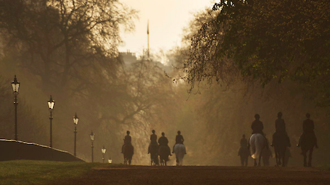
 Horses out for a canter around London's Hyde Park at sunrise. Copyright Chris Evans
 Ellen Desmarais is vice president of marketing at 500px