LVMH-owned Champagne house Dom Pérignon has interpreted a phrase said by its namesake Benedictine monk through a commissioned piece of art.
The Champagne brand has invited Japanese designer and artist Tokujin Yoshioka to create an artwork using the famous words of Dom Pérignon, “I’m drinking stars!” as the prompt. As advocates of the arts, luxury brands often work with contemporary artists to explore brand codes in various mediums.
A bottle full of stars
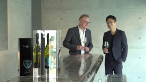
Dom Pérignon invited Mr. Yoshioka to create an artistic tribute to the Champagne maker’s 2009 vintage.
Using the “I’m drinking stars!” quote as inspiration, Mr. Yoshioka has designed “Prism.” The artwork is an homage to a “Champagne of living light” similar to a prism’s colors and the emotion it triggers.
A signature of Mr. Yoshioka’s work is his use of light as both a material and a medium through crystal prisms.
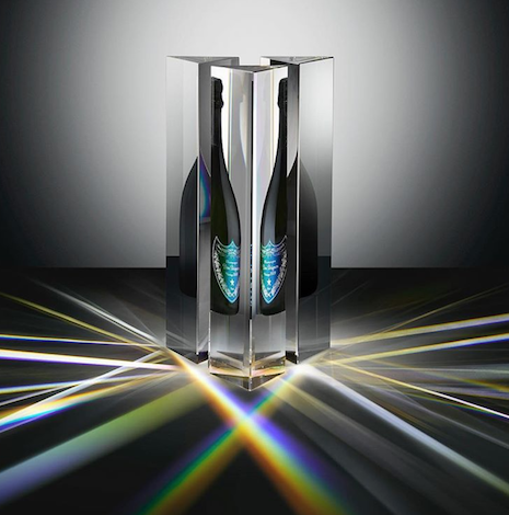
Dom Pérignon x Tokujin Yoshioka's Prism. Image credit: Dom Pérignon
In his work for Dom Pérignon, Mr. Yoshioka used his signature medium to create a limited-edition piece that recalls the “vibrant spectrum of the sun that gave the wine its rich yet elegant complexity.”
To highlight Mr. Yoshioka’s creative process and the signed limited-edition, Dom Pérignon has shared a making of film to its YouTube channel.
The minute-long film shows how a bottle of Dom Pérignon Vintage 2009 fits within the center of the prism created by Mr. Yoshioka. As the bottle is placed inside light is refracted and the Champagne is shown to triple.
Each limited-edition Dom Pérignon Vintage 2009 Prism will be signed by Mr. Yorshioka.
Dom Pérignon x Tokujin Yoshioka - Making off
Each year, Dom Pérignon commissions an artist to take an element of its brand and create an original piece of art.
Last year, Dom Pérignon deconstructed the letters D and P to demonstrate passage of time and the transformation of materials.
The creative approach for Dom Pérignon’s limited-edition labels and packaging came from a collaboration between the Champagne house and German artist Michael Riedel. The “optical metaphor” created by Mr. Riedel paid homage to “creations that transcend the original materials” by turning letters to abstract forms (see story).
{"ct":"zDRuec784qMpY4qnEcEG1y86AqWP3KeOyhLBS9Tj93+6U9TE0g1ST0eVVde46\/dzrXQK1VYY1j1V\/VmJzTH7s\/gZgV32Y3VQkkjtSL6hvVi0hfzY6+B0XCp5wx03Dw0JOLk\/kF\/5TuqyURJIIg2WF4jgC4k2dl\/zd5chFWVeT+2+RdJ0dnyHinOxYjgoHYPh99gjub6EDuD33fOeAh2TmJp3jtGPoIjEqvOKp1XWimQs0lJbcqLzseD+fwk0k5Sn5A6U5\/gW1rPef+Iyl4HcKAtnSUs4036w\/B3wqwZGm3ecRjTgvYATwFD2rL+RYPwp\/kItOMW2XnaWIrfeBzPRHpn2blrKaeW0WRJ1swcQlsrOuVnDXaSpunvffIq5HgghwtDmPSIDozM2m\/i2xcYDjghCX5IL3aPxl43p2Ix4\/udw6vkiDMInY1\/Hg8w0xKni055SdqmZA6pSf5BGJOKsolsBotY57crlJ\/AwPKnkRSag1QBKvG05cHlLsEOFzRTbNsISNa7xoxV1Tb+yiR55VebtvGipwtlfq0RmypjvqKbHoB7xqaD71H0z+hO8KeIxVqjoNGgTcat2199c1fbx5M9DlLjESkHcoGEw+mvlCQZy0ISmFxTsZ2xbFIF9w3s029EyqU7NlLpZy5VzUPqLurqiEOTMu97mfMng+Mpzqi+DbloheQGwy90T+p1M2Sdk7phuHD9D8ZkxG61pwo0P5OZ1wQkvpBFkslsF9xneP1CKGiVlsZLEalBKs27Ij4LWi\/m86VqXrLO3xqPHuVdvaLjz7\/ni5PJ4vPrGgsie0ZyCIoLrj4YFJJlbV947jfVrHKiNoCxuGbEJuw539n0b+2jBgCFef2cTLJNmnHnlLWuC3AVtRIYQ1pNVZplchc3OkmuvYTVbO55j87yVqJ2WX1+sosNG1UMuZT1ZVhSkRhNOuLnboOlI3pNlfcTPubVRrFnEPEX6gzrW0LNMXPLgJdyp0ppK0bBIQj4hfHvnOxfJt03kf0+Rk6pCjBfSQVBFqnjBZu5LZa3dRWEodbMKKFunVNN\/iFhsqK3eW0lRorBVVRJQCNWTEX3h6nqXOG47C1QpJpJoq2wVetdO7m1mY2Rccw\/7mfJ\/Kr+\/zf2fI6VbuoDrTjiRwyJtdmXpb7I6cHZFer+RfyjvcrS2KSRAO6yMO3RK8YYFBDF55u5bzwlVT\/sOymAovISnDrJ\/RNqgsD3yOqb+Kb\/30kCDcOMaUlpnr1iD3UVxU+SYoWnnrphgLubB2xDLoZQF8DSQroYSZIHuIiBDOV5NI8t\/MzweFDjwl9N3Ca085j+rB\/c0TA+JnnNOFy1E+6JYrNG9cVXxhi8hT22PBH\/a8mFejZ3FbjAgviOLnzQvGdKYv2HXE2Amkni0Znd+BHzlsi46brU8KIOXsxbqrnxIbypaZeDjzHiWhVKoAnJTiTx\/uzseAglcgrs4iDish0LgS8ZuvltSOiefzwQs0njXMp3EnRpVAht\/S3O3fRzgPuPOAqM5KvibnKKL8ePAIQTFX9KOFCuGTd7aZwTQUT6QQ97QSOrX+hao78hfDBDxK7ezgh2sievEOmf6F4Py809FDyUozTXxRljt0Ibfy8SS+uP2b2mSwD21xwz973zB9k0L8Wib+0nY+21g2xTS9Ep1nhpVJj+aKuCARvOWul9XhwscYfuFWNflSx+wACCGCMVRPIEvoCtdNZ+i2CfQ\/v2c1Ydt6vBTi8WuTtcHfvwx5WrSe81I5ePVgU5G6cupPmuyLHJezAsLJ0lS7Oy9o3Xo7jg6E2H3dFH27nDii4Jl8sJe2CgcufJzqUNSKEHSN4obemPjli5zANTRSfgQqNLXO2TitEMUiLiOtsB+DL70lqq\/bDq6HkTV4yxowwlFZzI2Iuri7I5qqQ9Slefj8uhXYuMcgPhGQiZyLz4MIXctLpdIQd4OD0UIjEzuZcxql+Lid8PCzng6+Q6JGWQagW1GA31Dvqamp+btMNzOjdW0Yv\/lL0D77thJqVqOz+MKW5GZOlNtgPKC+nKM4YxnrMJv5CQwRHXpFaBS\/CgY8vZ3BJMKTGX\/yol+7QmUskoOsgCoA1nTsOO4wJBs2qYDG4491KBPRxVNpV+hYqVyNgf++cernHjWv\/ZPqzbnH1RfudUPMRKsMxxxqB5SE7A7pMR7VxxZZkMC8nwGauZEFfBnbBfnigL+vYxzsKqA\/PR0tsQBswympSyqleBRTOcEjSGazPPWM\/lPeqxe7aBWciGl5Qg\/\/ftzgXn+xGonp55ncoblVGp0BFjOKLgaqIA4K\/P6tIm51oOmVVLBvZ7oBHaNZNGoa7EJ\/IKpxIZ761EGwfT\/8BwrA+aylJ5MuzrDFceh\/aPsEpy25EAAPRaGTUTV8tn4qb2ZTuEEHWDEs\/2tVh7OrFB1i1KuBUxd5iYrJ6tfKdVDQp3MenhhQXc5z6+8mBi915ZFM5xraQtCEyc7kcQvZWLNNKmD6QYpgsI7HtZ+27nJ1AOPXKZuTzqjfLoNFSZC\/PbHwb84TO6GfNh4v23QbjR5IPvadq6rbgd6wOb6Wd\/HR0kSVyQSBMPZtQ4evTvnMldTEwFTsaCjcxQ2b86mBbRJA\/zUK9Quw6E0rZgoXkd6OC9R4koaWLoU0MYZkZBS2+HM2JlIEYMBCJQcs1hWkgcRlJy\/3JjosQt8jubKANJmSdMHz2DedkaOKyfXldY8rr3bez4KHTvOJrQ2fXceCIW+PAebCwXj7KFLsg3B+qEFXHlFgfm1pYb1BEui3+fi6ig6RHexvCw49hLeylx79Vvil8Val0QBE4UHKLTFY48qpYFl1Po1PBAO8\/QVC\/Z17s3VEwSdeF1RtCvG9keYnhUADytKpEzOJLr39JHOkxJRzjEQOTvyGP9Q3kkeaAcSTH7fm+IJ+eqBl1mvG9XrjqOinTLuLy\/OQPLokvK25weF3WhuBqy8MaVVfqfh3pn\/gdx6g4xurs67bS4jqyVjfHnpOrGHYXl698TF7H39vU9upFITX6OpJcUbQk0A7Uy4P9ZXgZSPJtgixTmeqKyFwpFT6c47M\/zCvMUhD7\/MtfNRldkowDAIw4nZ\/TqCyMQwrt+vZeqEG5bGM+bq8T+EbSLDlrM5a+3vm3HW2UG4kwjHOhAWLLemr6LdXyz9yr4qXtWk7wdg4bzuQLZcv+yxNuUSjZu7cCggNbrMqZy4kfEbMNs7tqoxgLiu7a3NMUlrE9IKAS3YlVGq5olQNfjnyEUxRWBLcMJOnlPvNQysBUimNoNQvK5cDOFWmKezEhExppKOwmpJMz2IiNx5So8V7fylqNrJrO3QBRonjr\/cvyPzNrIbrH\/cZmCO8ON9kFydhJV6vrIiRYE25HMOmitv8ptNWeSrDDAbp2XfLYsc7OAqKSwpEmZPFZtd9\/sMveXO0W8kPrgZS2bbTjVz8Kl66w7W2nJjgWCNuEmVlJEBYXPYyp6TL0VcQgRJrXbNyegL1\/DubhQtemYMZ61qyFpwBumI2xiZgsz4vdoWgTnxf3NPBF4ntSf\/E6qg175qe0b2oRm1smCtC2did53SYC1C451BhIqRBstQdSCPMPKeAVnVlzNfGn8\/Y8IzS\/axvPRJouVFDri1wdpZACHmoxXE2nYSKTy3SnRVCYUoY30GtZzn7XJ11gAFrvQsLoC6D+Ttj79a+y2EhkiGhx1uFOeJMNYy+lRRgmMceYKZRFpzmRwqg1DKqiONC2ygsZIu7YG50mUYPNyBP8e+MPHa5SOakNoL4MCVxd7Joj0vX+LCytijtVDhQy3ZLguOxyByDONS6t6SL1GJWFqX\/5yxDj6QIdmyazbO9ruINk4tIWNWh70etBiksd4gvsaMHiLs8tDAmibQW6NH5\/P+t19DIycWTJpmjtLKRNxC5FN7Oa7apLw+O7CI1xjX8IrYnPrbJTFj7pZ04Fk6Uy3FPJjaOmVme4kbgXbEK4np6l\/3Y4\/IkFAYehhqSm5nfH4c99C2CYF+O60ZOcoPIQjBpBdMwoWXqHZOrWaBKdYVBm0edAZVLzO5WJE1RT5bd95ddgTrXsX7+SLbU3MQgJfvbe03sDCzibSqZz\/qrjEQ9QxYvPD2PH\/bdH4h9iiC4V7bc3Zpepz393LiSnyd+izFwMEN\/DWVsY9J46e6qR9pGWrAh947dNMvT++8eZVqgSs50\/lLsvQ\/zagS7ntI8xAgUjk5s\/NmSZ38gK55In0XbbztXjR87yl3iRVqeHFBO0K3BgpnhuVocqQeyJFFeT82t2Z\/099RrPGpOd7opmtz\/riSSGyKB+Wtk3dk3h+fIH2MOAU+6pcg26LrZQKy2iyF5ZXum4yq3ds3k5o=","iv":"2fb4b15f2d23b24e6cec60334ba52441","s":"b9ab160017a8c63e"}